How to Wear Color at Work This Fall: A Guide to Chic, Polished Combinations
- Aug 1, 2025
- 3 min read
Updated: Dec 22, 2025
Adding color to your work wardrobe isn’t about going bold or defaulting to neutrals. Think of it as your roadmap to refined color—intentional, wearable, and far from predictable.
Our clothes are our second skin; it’s how we introduce ourselves without speaking. This fall, as many of us return to offices where dress codes feel more flexible, the chance to express yourself through color is more exciting than ever.
A question I often hear is: “How do I wear color at work without overdoing it?” Most of us play it safe with black, white, and neutrals. Reliable, yes. But they can mute individuality. The right color, chosen thoughtfully, doesn’t just elevate an outfit—it changes how people experience you.
Why Color Matters at Work
For decades, the “work uniform” has been celebrated. Think Steve Jobs’ black turtleneck, or executives in sharp suits. A uniform reduces decision fatigue, but it also strips away personality. Today, many professionals want balance: the ease of consistency with the freedom of expression. Color delivers that balance.
Color is not only visual—it’s emotional. Pantone’s Autumn/Winter 2025/2026 trend report highlights rich jewel tones balanced by grounding neutrals. Shades like Amethyst Orchid, Midnight Navy, Raw Umber, and Winter Sky carry presence, mood, and energy into the room with you.

Where to Begin: A Practical Guide
Consider your role, work culture, and comfort (age, height, weight, weather)
Before diving into color hues, start with some self-awareness. Use these quick tips right away:
Your Age: Certain shades highlight youthfulness, others project maturity. Choose depending on the impression you want to make.
Your Height: Taller frames carry larger blocks of color. Shorter frames shine with tonal or balanced looks.
Your Weight: Structured tailoring and the contrast of light and dark shades can create balance.
The Weather: Crisp fall days welcome jewel tones. Softer climates pair well with lighter shades.
Work Culture: Creative spaces may embrace bold pairings. Conservative offices call for subtle elegance.
Texture Helps you Play with your Taste
Color can feel overwhelming when it’s flat. Texture solves that. Pair a silk blouse in a bold shade with tailored wool trousers, or layer a cashmere sweater under a structured blazer. Even simple palettes feel richer and more intentional with texture.
The Easiest First Step: Monochrome
If you’re unsure where to start, try monochrome looks. Step beyond neutrals and wear rose, green, or blue from head to toe. Monochrome always feels polished, easy, and uncomplicated, and allows you to add any pop of color that will help you create an interesting outfit that elevates your mood

The Color Wheel, Made Simple
Use the color wheel to guide you without overwhelm. Two easy rules:
Analogous Colors:
Neighbors on the wheel (blue + green). Soft, harmonious, approachable.
Complementary Colors:
Opposites on the wheel (purple + yellow). Bold, confident, striking.
Keep it simple. Stick to two colors, and let accessories like bags, shoes, or scarves do the experimenting.
Fall Color Combinations to Try at the Office
Nature is the best inspiration—autumn leaves, twilight skies, seasonal fruits. Here are easy pairings with ready-to-wear examples that don't include black:
Tan + Winter Sky →
Tan wool trousers + baby blue silk blouse + matching loafers.
Purple + Mustard →
Deep violet pencil skirt + matching tights + violet heels. + mustard sweater
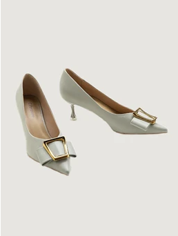
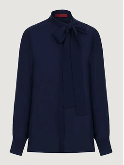
Mossy Oak Wide Leg Trousers + Printed Navy Blue Blouse + Scarf or a classic Poplin Shirt with a print scarf + pastel pumps
Gray + Sapphire Blue →
Gray wide-leg trousers + sapphire blouse + silver accessories.

An outfit idea designed for an important interview or client meeting Primrose Pink + White →
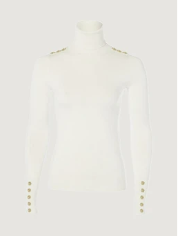
Primrose pink straight-leg pants + white turtleneck sweater + nude loafers + trench coat.

Final Takeaway: Color = Presence
Workwear today isn’t about blending in. It’s about showing up with intention. Adding color doesn’t make you less professional—it makes you memorable.
Start simple with monochrome. Explore texture. Experiment with the color wheel. Try pairings that excite you.
At the end of the day, the colors you wear aren’t just clothes. They’re part of how people remember you.


Comments